Nireeka
Tools
- Adobe XD
- Photoshop
- Illustrator
Platform
- Mobile App
The most affordable carbon fiber smart e-bike.
Nireeka is an electric mobility company that redefines the biking experience using its solid, sleek, and gorgeous design and strives to make smarter e-bikes with better performance.
Challenge
Because the application would be used outdoor and, in the action, it must have had a very high contrast UI and a very easy and familiar experience
Solution
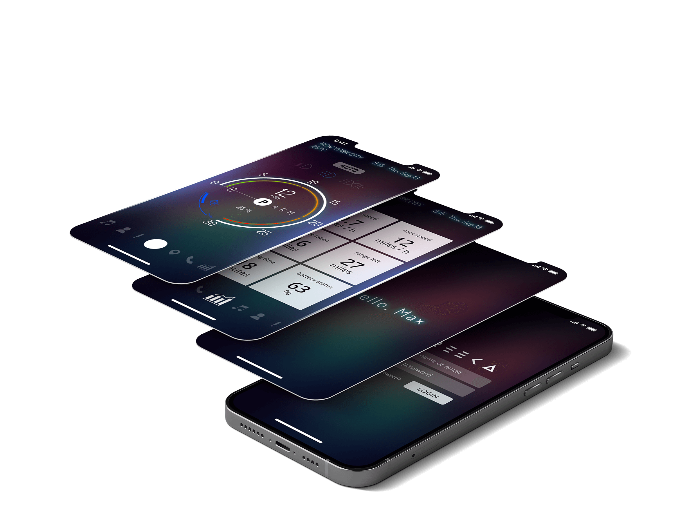
We designed a very beautiful yet very easy to use and understandable mobile application that worked great between different devices.
Project Phases
This project came in three phases- Mobile Application
The Process
Finding out
- Research
- Interview
- Benchmark
- Survays
- Market analyze
Shaping the Experience
- User Flow
- Wireframing
- Testing
- Interview
- A/B Testing
Design
- Brainstorm Sessions
- Identity
- Design System
- Components
- Prototyping
- Testing
Finalizing
- Usability Testing
- Accessibility Testing
- Final Changes
- Documentation
- Design Guidlines
- Developers Handoff
Nireeka Mobile App
(Estimated reading time: 1 minute, 36 seconds. Contains 321 words)Finding out
In this project I started with benchmarking all kinds of speedometers that have been already using. Because the application would be used outdoor and, in the action, it must have had a very high contrast UI and a very easy and familiar experience. After the briefing with the two founders of the startup and their design team, I gathered important data I needed to know about the bike and its features. After couple brainstorming sessions I was ready to start the design process.
Shaping the Experience
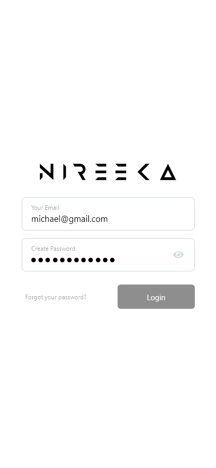
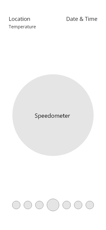
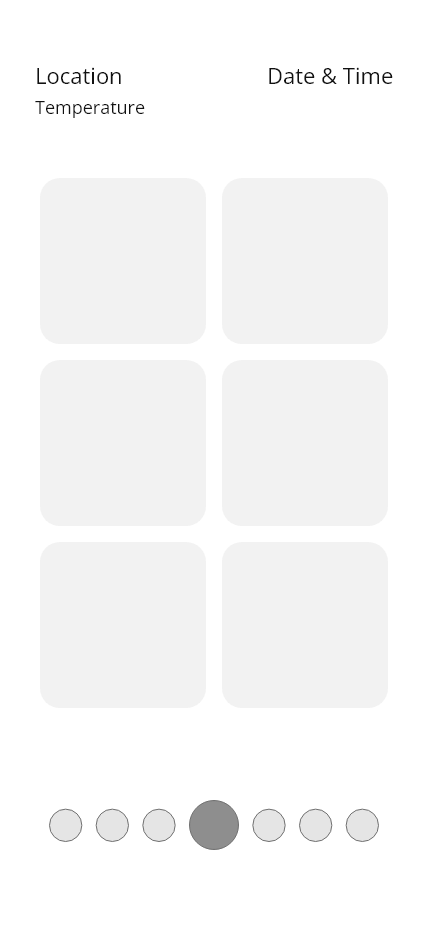
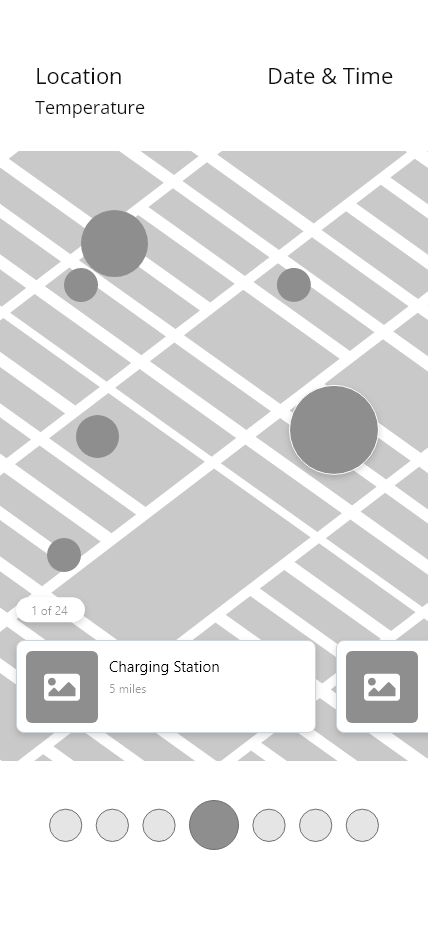
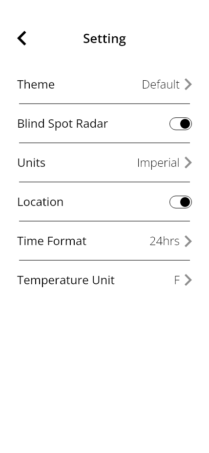
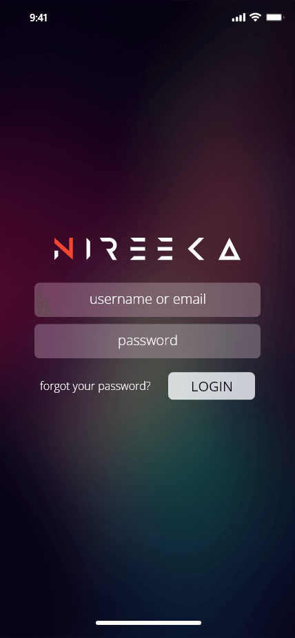
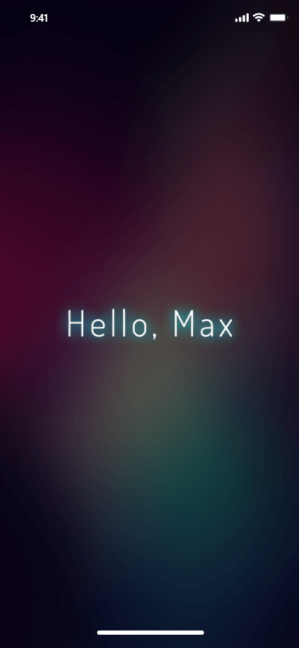
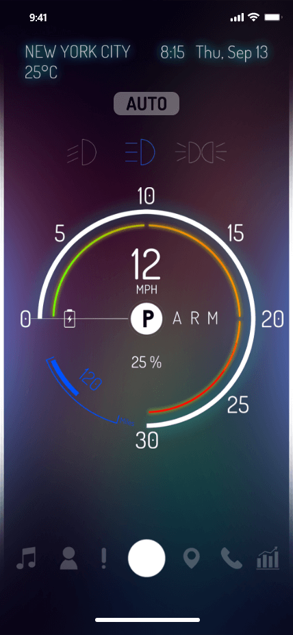
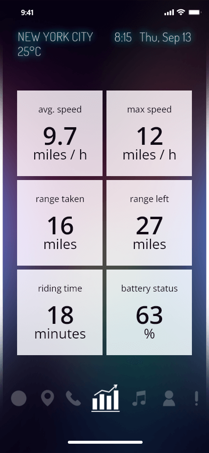
Started off with the flow user had to take. The process stakeholders had in mind was a little bit complicated and confusing. So, I simplified it to just signing in, onboarding screens and after that user had to scan the bike code in order to pair with it. The process was really easy and the user wouldn’t be confused and after taking really easy steps was ready to use the bike with the app. It was time to draw the wireframes. After wireframes drafts was ready, we went straight to test them with our test group and stakeholders. With the points and feedbacks, we changed some elements so that the main focus on the app could be on the speedometer, battery status, driving mode and proximity sensors.
Design
Based on the final wireframes we drew, I started to create the design system and elements based on our needs and our identity. It was almost complete; I just started to design the final UI and make the prototype so that we could test it in real environment. Meanwhile I had multiple meetings with our develop team to make sure they could translate my ideas into the application.
Finalize
After we tested the prototype outside with 3 bikers outside, I started to pack everything up and finishing the documentation our developers needed. The clock was ticking and we were close to starting our campaign on IndieGoGo. We needed a website for our campaign and our product. But that’s another story.
- Brief
- Process
- Mobile App
